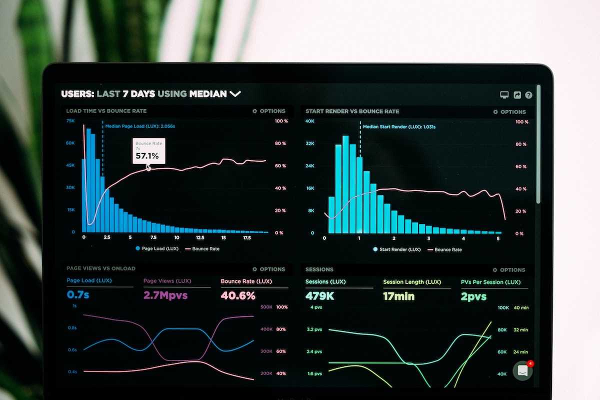
Real-time data visualization is a game-changer for you – data engineers and developers, and anyone who works with data. It allows you to monitor and analyze data as it is generated, thereby empowering you to facilitate quick data-driven decision-making.
So, whether you are dealing with streaming data from IoT devices or processing large volumes of data in real-time, real-time data visualization helps you gain insights into data and identify patterns therein that might be missed otherwise.
To ensure you get all the juice, in this article, you will take a deep dive into real-time data visualization and explore its benefits, examples in different industries, best practices, and tools. So fasten your seatbelts and get ready to ride the waves of real-time data visualization, starting with the benefits!
Benefits of Real-Time Data Visualization
Why should you consider visualizing real-time data? Well, it is an expert practice that offers several benefits to data engineers and developers. Here are some of the key benefits:
Improved decision-making: Real-time data visualization allows you to monitor data in real time and make informed decisions quickly. This is particularly useful in situations where time is of the essence, such as in financial trading, healthcare emergencies, and disaster response.
Enhanced data accuracy: Real-time data visualization can help you identify errors and anomalies in data as they occur, thereby enabling you to take corrective action promptly. This can improve the accuracy and reliability of your data, which will lead to better outcomes.
Increased productivity: Visualizing real-time data can help you automate tasks and streamline workflows, which will reduce manual intervention and free up time for more important tasks. This will increase your productivity and efficiency, thereby enabling you to achieve more in less time.
Faster identification of trends and patterns: Real-time data visualization can help you identify trends and patterns as they emerge—it enables you to act quickly and take advantage of opportunities as they come. This is particularly useful in areas such as marketing, where real-time insights can help you stay ahead of the competition.
So far I have briefly mentioned some of the industries where visualizing real-time data is a valuable practice, but since I promised to give you all the juice, the next section will explore these industries in detail with classic examples of real-time data visualization.
Real-Time Data Visualization in Different Industries
Real-time data visualization is used in a wide range of industries, from finance and healthcare to manufacturing and transportation. The following are some real-world examples of how real-time data visualization applies to some industries:
Finance: Real-time data visualization is used in financial trading to monitor, for example, stock prices, currency exchange rates, and other financial data in real time. This enables traders to make informed decisions quickly and also take advantage of market opportunities.
Healthcare: Real-time data visualization is used in healthcare to monitor patient data, such as heart rate, blood pressure, and oxygen levels. This enables healthcare professionals to identify and respond to emergencies quickly.
Internet of Things (IoT): Visualizing real-time IoT data enables engineers to monitor and control connected devices in real time. It enables businesses to optimize operations, reduce downtime, and improve safety.
Manufacturing: Visualizing real-time data in manufacturing allows you to monitor production lines and identify quality issues in real time. It enables manufacturers to improve product quality and reduce downtime.
Transportation: Here, real-time data visualization enables you to monitor traffic patterns, weather conditions, and vehicle performance in real time. It also enables transportation companies to optimize routes, reduce fuel consumption, and improve safety.
The benefits of visualizing real-time data are so enormous that they cannot fit on a plate—It enables businesses to make informed decisions quickly, identify errors and anomalies as they occur, and improve decision outcomes.
However, to get the most out of real-time data visualization, you have to follow some best practices. They not only expedite the entire process but also make it enjoyable. So, the next section takes you through the best practices for real-time data visualization.
Best practices for real-time data visualization
The following best practices ensure that you stay ahead of the competition and achieve greater success while visualizing real-time data. They are not just best practices but also key best practices:
Preparing and cleaning data: Before visualizing real-time data, you must ensure that the data is clean, accurate, and well-structured. These can demand you carry out data cleansing, normalization, and transformation, among other things.
Designing effective visualizations: You must ensure that visualization is effective—that is, it should be clear, concise, and easy to interpret. Your visualizations should also be tailored to the audience and the specific use case.
Ensuring data security and privacy: While you are visualizing real-time data, you should know that it might involve working with sensitive data that may be subject to privacy regulations. So, you must ensure that data security and privacy are taken into account at all stages of the process.
Choosing the right visualization tool: There are several real-time data visualization tools available, each with its own strengths and weaknesses. The next chapter will empower you with information on how to choose a tool that fits your specific needs and requirements, as this is important.
Real-time data visualization tools
As I mentioned earlier, there are several real-time data visualization tools available to you. Each has its own strengths and weaknesses. The following are some of the popular data visualization tools that update in real-time:
Apache Kafka: Apache Kafka is a distributed streaming platform that allows you to process real-time data. Though it doesn’t provide specific data visualization tools, it provides you with a high-throughput, low-latency platform for processing streaming data, which you can use to build your own real-time data visualizations.
Tableau: Tableau is a user-friendly data visualization tool that supports real-time data processing and visualization. It allows you to connect to a wide range of data sources and create interactive visualizations in real time.
Grafana: Grafana is an open-source data visualization and monitoring tool that you can use for real-time data processing and visualization. It allows you to create interactive dashboards and alerts based on real-time data.
Kibana: Kibana is an open-source data visualization tool, which you can also use to process and visualize real-time data, and create custom dashboards and alerts.
Microsoft Power BI: Microsoft Power BI is a cloud-based business analytics service that supports real-time data processing and visualization. It allows you to create interactive dashboards and reports that can be shared with others.
Splunk: Splunk is a data analytics and visualization tool that supports real-time data processing and visualization. It enables you to monitor, search, analyze, and visualize machine-generated data in real time.
Databricks: Databricks is a cloud-based data processing and analytics platform that supports real-time data processing and visualization. It allows you to create and deploy machine learning models in real time.
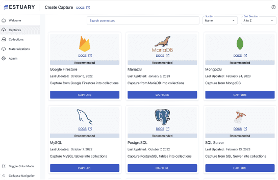
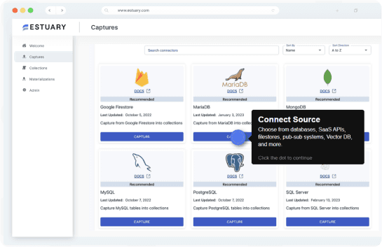
Estuary Flow: Estuary Flow is a cloud-based DataOps platform that supports real-time data ETL and data processing—it supports your data visualization efforts in a variety of systems. It offers several unique features, such as:
- Ease of use: Estuary Flow has a simple and intuitive interface that makes it easy for you to process real-time data, even if you have little technical skill.
- Real-time data streaming: Estuary Flow can stream data in real time, enabling you to monitor data as it is generated.
- Flexible workflows with connectors: With Flow, you can push real-time data to real-time databases like Rockset and Firebolt; warehouses like BigQuery and Snowflake; the Elastic Cloud, and more. With real-time data in these systems, you can complete just about any real-time data visualization you desire.
All these tools offer unique features and advantages for real-time data visualization. In most cases, you’ll need to string multiple tools together as part of your real-time pipeline: you must transport and transform data before you can visualize it. For example, you could use Estuary Flow to move and transform your data, and create a visualization in Kibana.
Challenges of real-time data visualization
While real-time data visualization offers several benefits, there are also common challenges that need to be addressed. Here are some of them you might face while visualizing real-time data:
Data quality: Real-time data visualization relies on accurate and high-quality data. Poor data quality can lead to inaccurate or incomplete visualizations.
Scalability: Real-time data visualization can involve massive amounts of data, which can be challenging to process and analyze in real time.
Security: Real-time data visualization requires robust security measures to protect sensitive data from unauthorized access.
Complexity: Real-time data visualization can be complex and requires specialized skills and knowledge to implement and maintain.
Future of real-time data visualization
Nevertheless, despite these challenges, real-time data visualization will continue to grow in popularity in years to come. Here are some future trends you should expect:
Machine learning integration: You should expect real-time data visualization tools to integrate more machine learning algorithms to help you and businesses identify patterns and anomalies in real-time data.
Edge computing: You should as well expect real-time data visualization to be integrated with edge computing to enable you and businesses to process and analyze data closer to the source.
Augmented reality: You can imagine real-time data visualization being integrated with augmented reality to enable you and businesses to visualize data in real time in a more immersive and interactive way.
Cloud-based solutions: Real-time data visualization is also expected to be increasingly cloud-based, thereby enabling businesses to scale their visualization needs based on demand.
Conclusion
You can use real-time data visualization to monitor data in real-time, make informed decisions quickly, and identify errors and anomalies as they occur. To get the most out of real-time data visualization, you must employ best practices, such as ensuring data preparation and cleaning, choosing the right visualization tool, designing effective visualizations, and ensuring data security and privacy.
You can use real-time data visualization in a wide range of industries, from finance and healthcare to manufacturing and transportation. As more data is generated in real-time, the demand for real-time data visualization tools is expected to grow. Hence following best practices and choosing the right tool for your specific needs can help you harness the power of real-time data visualization to make better decisions and improve outcomes.
While there are several tools for real-time data visualization, Estuary Flow helps you integrate them all into a user-friendly app while preserving data quality. So if you're looking for a powerful tool that can help you visualize and analyze data in real time, give Estuary Flow a try today!
Thereafter, you are welcome to share your experience on this public Slack channel—there is a growing community of data engineers and developers who are enthusiastic to hear about your unique experience with the tool.

Author
Popular Articles

